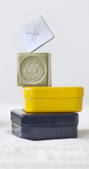
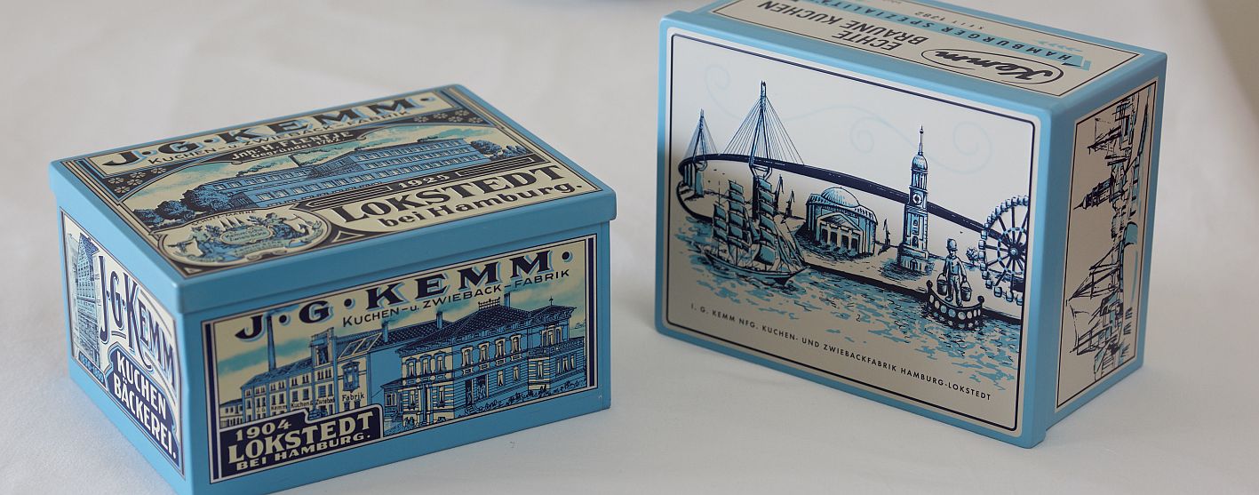
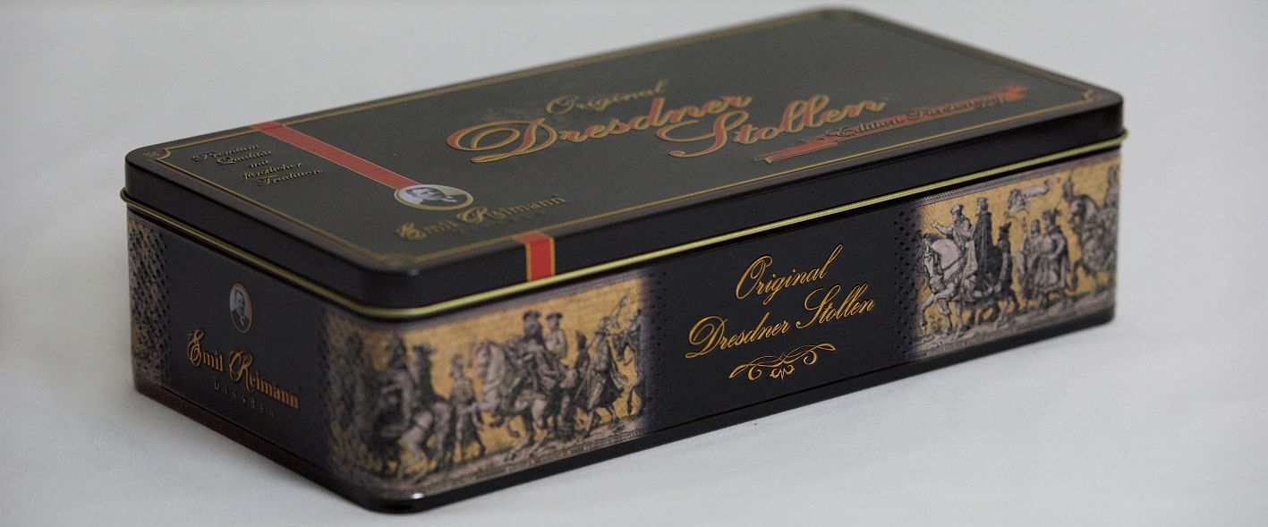
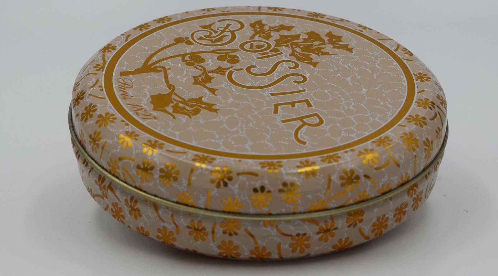
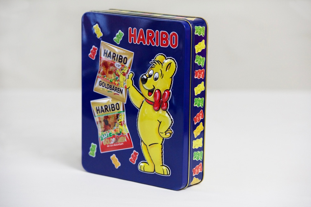
One of the most striking qualities of fancy tins is how color is reflected by the shiny effects of tinplate and aluminum. Not only can colors on fancy tins display magnificent designs, they can also trigger wonderful memories of good times. Here are ways that color plays a significant role in attracting consumers to packaging, leading to purchasing decisions.
Colors of Surroundings
The visual world is responsible for so much of a consumer's perceptions and connections with emotions. For most people fortunate enough to have clear vision, colors are extremely important from an early age for shaping perceptions and sometimes even judgement. This phenomenon is due to color associations with emotions that are learned as a child. These associations come partly from the environment, partly from exploration and also from how children are raised.
Some of the earliest associations kids make are between blue with sky and green with plants. Perhaps orange juice is an early drink they consume, as orange takes on a happy emotion and flavor. Yellow associates with sunshine while black in linked with night and darkness. These associations are among the most common, but it's important to point out that each individual makes their own unique color associations.
The three primary colors of light are red, green and blue. The secondary colors are cyan, magenta and yellow.
Looking at the bigger picture when one studies a color wheel, the five main colors most commonly perceived and used to make other colors are red, yellow, green, blue and purple.
How Colors Paint Emotions
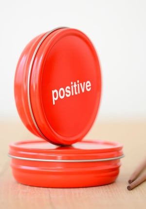
Awareness of color associations form a key building block to both marketing and design. Some colors are perceived as exciting, while others are perceived as more relaxing. Most colors are generally linked with positive emotions, depending on the individual. Blue is thought of as a more tranquil and heavenly color that evokes feelings of trust.
Even the achromatic colors of white, gray and black are often perceived as positive in some way. White is widely thought of as clean and powerful. It also blends well with many other colors, as do gray and black. While black is sometimes linked to danger, it's also commonly associated with strength.
Every color may have multiple associations for any given individual.
Green equates with freshness and relaxation, much the way house plants trigger the same perceptions. Once these perceptions are established at an early age they can trigger emotions that connect with them, based on experience. Usually brighter colors are the most related to happiness and vibrant energy. Red, orange and yellow are particularly vibrant colors, which is why they appear so much in upbeat cartoons for children.
Hues, Brightness and Saturation
Scientific understanding of galvanic skin response (GSR) developed in the 1950s in relation to colors and emotions, as red and yellow were found to create more excitement than blue or green. But color studies as late as the 1980s were still relatively vague compared to what researchers learned the following decade.
A more definitive link between colors and emotions was published by the research team of Patricia Valdez and Albert Mehrabian in their 1994 article "Effects of Colors and Emotions," which appeared in the American Psychological Association's Journal of Experimental Psychology. Their study was based on how the three main components of color - hue, saturation and brightness - affect human emotions.
Hue can be described as what people recognize as color, which can be measured by wavelengths of light. A hue may be a pure color like green or red, or a mixure of colors such as red-yellow.
Saturation, also known as chroma, is a hue's intensity or purity, expressed in a percentage. A pure color has a saturation level of 100 percent.
Brightness is a perception also known as luminance, which is measured in percentage. The brightness of LEDs and other lights are measured in lumens, but in relation to colors, brightness is more of a perception that varies among individuals. The higher the saturation, the brighter a hue appears.
Other terms used to scientifically measure and analyze color elements by artists and designers include tint, shade, tone, lightness, intensity and grayscale.
These terms go much deeper into understanding color effects and how to use them artistically. Learning the color wheel - a diagram that shows how hues are related to each other - is another deeper science for graphic artists to learn.
Hues and the color spectrum in general began to enter scientific study with Isaac Newton's 1704 book Opticks. It included an early color wheel designed by Newton, although more modern color wheels were developed in the next few centuries.
Behaviors Influenced by Colors
The color research by Valdez and Mehrabian revealed that saturation and brightness are major factors that trigger emotional responses. They found that the most pleasant hues included blue, green and purple, while the least pleasant were yellow and green-yellow. On the other hand, green-yellow fell into the category of most arousing, along with green and blue-green.
From earlier research they learned that red and yellow were generally more arousing than blue or green. Yet they observed high anxiety responses were associated with red and yellow. As mentioned earlier, multiple emotions can be triggered within the same individual. Sometimes it simply comes down to what's going through a person's mind at the moment that see a color and the memory it evokes.
Perceptions and Meaning
Company logos often include colors for a reason. Black and white is the cheapest way to go, but can sometimes look classy.
Colors such as red, green, yellow and blue can bring much more emotional diversity into the picture. Usually logo designers advise clients to stay within four colors to keep printing consistent and affordable. Too many colors can start to look busy and create complexities in printing.
A rainbow typically contains seven colors in its spectrum: red, orange, yellow, green, blue, indigo and violet. Actual rainbows following rainfall take on different appearances, depending on the angle at which they are viewed in relation to the sun.
Experiences Shape Perceptions

One of the main themes that designers of fancy tins must always keep in mind is that every individual interprets colors their own way. At the same time, everyone within a certain culture often experiences the same imagery. The colors of a national flag, for exa
So designers must remember that different strands of perceptions exist among all target markets. It's helpful for the designer to study the results of color tests with target market participants for specific lifestyle products. These results will help fill in the blanks as to which colors work best for emotional impact. mple, evoke emotions of patriotism for a majority of the culture. These colors are consistently associated with national events on down to the local school classroom.
Connecting the Colorful Dots
Scientists and marketers have so much more to learn about how colors affect emotions and consumer purchasing behavior. Essential points to remember are that brighter colors are capable of stimulating energetic responses, while lighter colors have more subdued effects.
Fancy tins are commonly made of tinplate or aluminum, which is one of the best metals for displaying and reflecting multiple colors. The most important other element that ties all these concepts together is the designer's imagination.

References and Further Reading
- More articles on Fancy Tins (2019 - today), by Alex Cosper et al.
- Relationship between color and emotion : a study of college students (2004), by Naz Kaya.
- Analysis_of_cross-cultural color emotion (2007) , by Xiao-Ping Gao , John H Xin, Tetsuya Sato and Aran Hansuebsai.
- Effects of Color on Emotions (1994) , by Patricia Valdez and Albert Mehrabian.
- Tough package, strong taste: The influence of packaging design on taste impressions and product evaluations (2011) Liza Becker , Thomas J.L. van Rompay , *, Hendrik N.J. Schifferstein , Mirjam Galetzk in: Journal of Food Quality and Preference, Volume 22, Issue 1, January 2011, Pages 17-23
- Read more on Luxury Packaging by Alex Cosper
- From Disgust to Desire: How Products Elicit Our Emotions (2004), by Pieter M. A. Desmet, in Design and Emotions, edited by Dena McDonagh et al., page 8.
- Definition: Luxury Foodstuffs (retrieved 17.10.2017), Wikidata
- Luxury branding: the industry, trends and future conceptualisations (2015), by Yuri Seo and Margo Buchanan-Oliver
- Food packaging: The medium is the message (2010), by Corinna Hawkes
- More articles on Chocolates , Biscuits and Confectionery packaging, by Alex Cosper and Dawn M. Turner
- Multisensory design: Reaching out to touch the consumer (2011) by Charles Spence and Alberto Gallace
- Assessing the influence of the color of the plate on 2 the perception of a complex food in a restaurant setting (2013), by Betina Piqueras-Fiszman, Agnes Giboreau and Charles Spence
- Does the weight of the dish influence our perception of food? (2011), by Betina Piqueras-Fiszman, Vanessa Harrar, Jorge Alcaide and Charles Spence
- The weight of the container influences expected satiety, perceived density and subsequent expected fullness (2011), by
Betina Piqueras-Fiszman and Charles Spence


